
Have a look at those stunning website design trends that we have noticed in 2021.
Maintenance of white space and minimalism
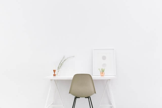
Let us first define the minimalist website design. It is a simple interface without unnecessary elements. Most of the websites with minimalism have monochromatic designs. You will find not more than two accent colors. The shades of grey, black, and white are common to these websites.
Thus, there is a limited color palette used for minimalistic websites. However, designers always ensure that the color scheme has enough contrast to make it legible to viewers having color blindness.
Another web design trend in the recent years is to maintain whitespace, also known as the negative space. In the early days, designers used to fill up this space with tables, layouts, and animations. White space is essential to distinguish the main element, but it serves some other purposes also. It maintains a balance by removing clutter created by animations, GIFs, and other elements. Moreover, it adds a touch of sophistication and elegance to the overall design.
Going beyond typography rules
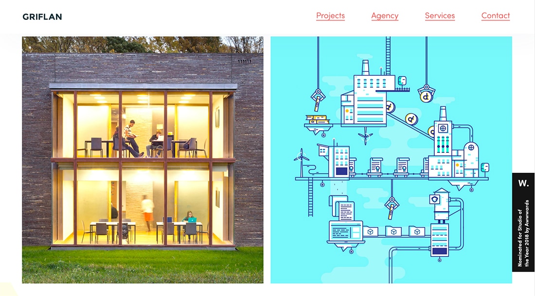
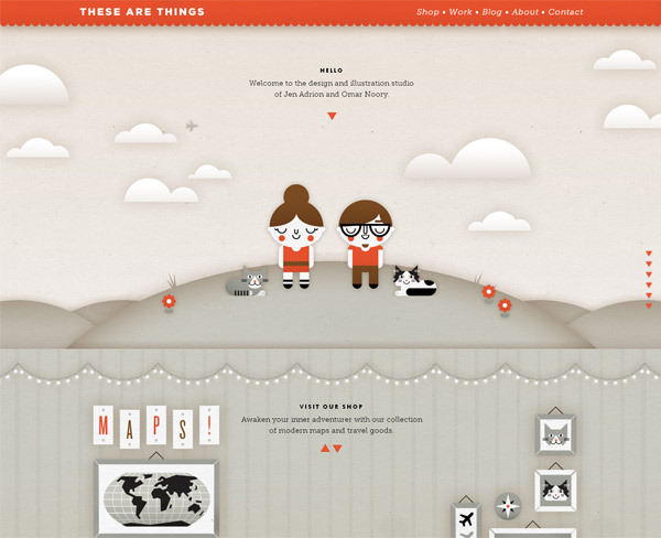
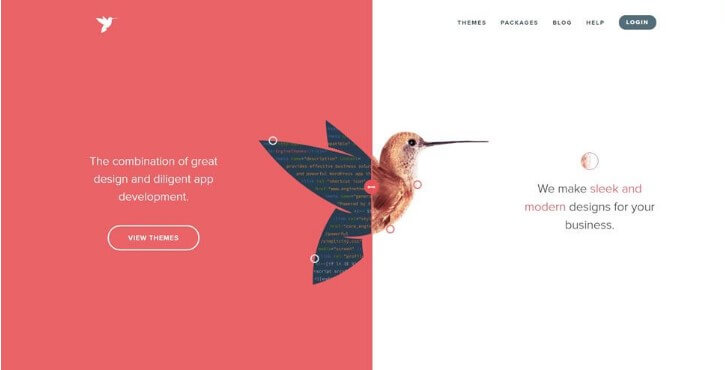
Blend of realism and illustration
Photos versus illustrations– Which style will you apply?
The web design trend 2021 combines these things to make the overall design delightful, engaging, and stunning. It is another rule-breaking trend dominating the year, 2021.
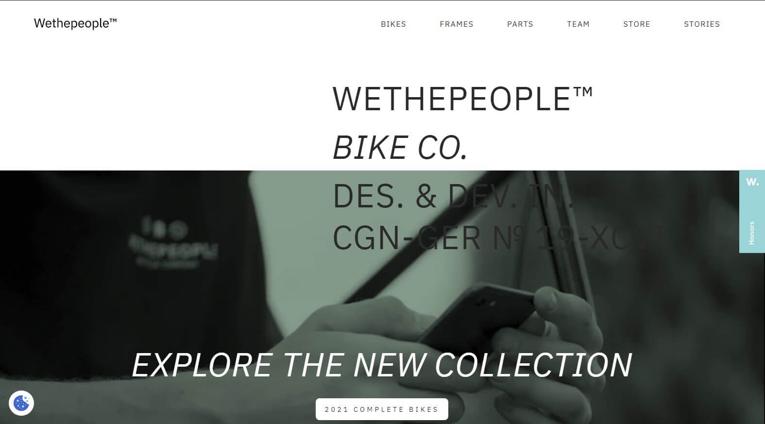
Asymmetric design
Asymmetrical web design techniques are visually intriguing, creating unique focal points. However, the absence of symmetry does not result in a lack of harmony and balance. Besides, it ensures dynamic outcomes, and designers get the freedom of design. There must be a visual balance on every website. This visual harmony is achievable with asymmetric designs.
Designers focus on the size and color of elements before arranging them. There are different ways of applying asymmetrical design techniques for your website interface. One of the easiest ways of developing a sense of balance is by blending contrasting elements, like text and images. The trick lies in the way of putting them together.
However, words and images have to convey only one message. It is also easy to create asymmetry by choosing contrasting colors, like black and white. You know about the color wheel principles needed to design a balanced color combination. That is why you need to choose colors, which have less harmony and symmetry. Although it is tricky to create an asymmetrical design, it looks beautiful.
Videos as design elements
Videos have turned out to be the ubiquitous web design elements to communicate information in the most interactive way. Some professional designers have gone further by integrating navigation menus, unique visual effects, and soft transitions into background videos. They can add these background videos simply by using Flash. What’s more, there are special tools to your video clip into stunning shapes to insert some floating elements to the site.
The web builder, Wix also has a versatile feature, known as the transparent video that enables you to avoid traditional MP4 streaming limitations. However, videos have some limited ability to create transparent backgrounds without compromising on quality. You can find a big collection of different transparent videos that are easily customizable.
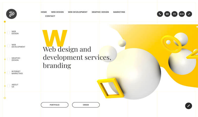
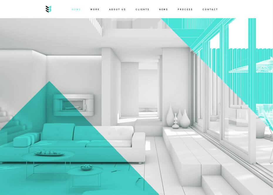
Shapes and abstract designs
Scroll effects
Since the introduction of the infinite scrolling trend in 2011, we have identified interactive values in these scroll effects. You may incorporate more than one scroll effect to add fun to the browsing session. Scrolling is something about interaction, participation, and transition. You can amplify them by adding dynamic effects. Some commonly chosen scroll effects are horizontal scrolling, zoom-in and zoom-out of images, and transition to different sections.
However, the most popular one of them is infinite scrolling (parallax). This scrolling effect lets visitors stay on the webpage for a longer period. Some scroll effects are interactive and illustrate stories, and they give visitors a reason to scroll the page.
Pastel colors and black shades
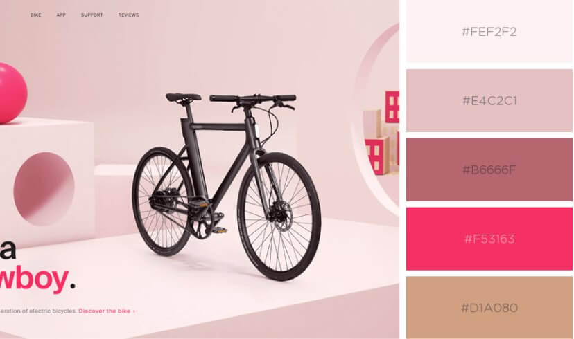
Nowadays, most of us spend long hours looking at the computer and mobile screens. That is why web designers like to add a muted effect with calm and cool setups. Black hues and pastel tones are the best options to create this effect. Designers are looking for the perfect color combinations that let visitors feel cozy.
But, what are these pastel colors?
They are soft and subdued shades with low and medium saturation. They do not look bold and give a soothing sensation to our eyes. Moreover, the use of dark shades makes the website look classic and sleek. It is also a way of maintaining a minimalistic scheme with white and black elements.
Voice User Interface

Due to the increasing use of IoT devices, there is a trend of creating Voice Interface for website designs. Amazon, Facebook, Google, and other big firms have already invested in the voice interface. Voice interface design relies on the speech recognition technology that enables users to use voice commands to search something. In the future, voice technologies may replace the Graphical User Interface, and they will save time while typing URLs on the small screen.
However, users always anticipate that their devices have to be able to identify commands without mistakes. In fact, AI has the potential to understand our spoken commands. That is why designers have become reliant on this technology for the Voice Interface.
Split content
- Develop a common experience for both mobile and desktop users
- Create a visual flow
- Make a design pattern working with some other design trends and techniques
Split-screen designs are the perfect options for responsive frameworks. When it is a bigger screen, the design gets split. However, the smaller screen can stack together with the panels. Interestingly, two symmetrically designed panels can easily make a modular outline of the overall website design. One of the most notable split-screen website design trends is the presence of multiple clickable zones. Originally, split-screen websites had two CTA buttons per screen.
However, today, you may find these splits containing other information. Thus, it is one of the biggest shifts in split-screen trends.
Dark themes- One of the latest web design trends
Dark interfaces look stylish, dramatic, and elegant, and they can create a lasting impact on the visitors. We know that contrast and readability are the major reasons for working on a bright background.
However, some scientific research proves that there is a need for the black font on a white background for optimal legibility. But, branding is one of the factors to decide on the dark theme for your site. Not all brand colors and logos work with the dark mode. Some designers prefer dark UIs to reduce digital eyestrain.
Due to the increasing use of digital technologies, most of us stare at the screens for several. It can result in eyestrain, stinging eyes, neck pain, and headaches.

Conclusion
We have talked about the top web design trends of 2021. There is no need to use all of them at a time for your website. However, it is better to be aware of modern design elements for websites. Although design trends will undergo change every year, they will contribute to usability.
Some other Posts you might be interested in.

Crafting Teasers for Elias On Time, Every Time with QuickReviewer
Streamline Creative Design with QuickReviewer for Your Video Game Launch

Review and Approval Magic Part 3: A New Website for the New Year
A Fresh Start: New Year, New Website As the calendar flips to 2025, many businesses take the opportunity to rebrand, refresh, or launch a brand-new website. A new website represents a fresh start – a chance to improve user experience, showcase modern design, and...

The Gift of Time: How QuickReviewer Saves Teams Hours During the Holidays
The holiday season is a time of joy, celebration, and connection—but for creative teams, it’s also a period of intense activity. Marketing campaigns, promotional materials, and end-of-year projects demand attention, often with tighter-than-usual deadlines. Amid the...